

Cohort analysis with R – “layer-cake graph”
Author

published
Cohort Analysis is one of the most powerful and demanded techniques available to marketers for assessing long-term trends in customer retention and calculating life-time value.
If you studied custora’s university, you could be interested in amazing “layer-cake graph” they propose for Cohort Analysis.
 Custora says: “The distinctive “layer-cake graph” produced by looking at cohorts in calendar time can provide powerful insights into the health of your business. At a given point in time, what percentage of your revenue or profit came from new vs. repeat customers? Tracking how that ratio has changed over time can give you insight into whether you’re fueling top-line growth solely through new customer acquisition – or whether you’re continuing to nurture those relationships with your existing customers over time.”
Usually, we focus on calculating life-time value or comparing cohorts, but I was really impressed with this useful analytical approach and tried to do the same chart in R. Now, we can see what I’ve got.
After we processed a great deal of data it should be on the following structure. There are Cohort01, Cohort02, etc. – cohort’s name due to customer signup date or first purchase date and M1, M2, etc. – period of cohort’s life-time (first month, second month, etc.):

For example, Cohort-1 signed up in January (M1) and brought us $270,000 during the first month (M1). Cohort-5 signed up in May (M5) and brought us $31,000 in September (M9).
Ok. Suppose you’ve done data process and got cohort.sum data frame as a result and it looks like the table above. You can reproduce this data frame with the following code:
cohort.sum <- data.frame(cohort=c('Cohort01', 'Cohort02', 'Cohort03', 'Cohort04', 'Cohort05', 'Cohort06', 'Cohort07', 'Cohort08', 'Cohort09', 'Cohort10', 'Cohort11', 'Cohort12'),
 M1=c(270000,0,0,0,0,0,0,0,0,0,0,0),
 M2=c(85000,275000,0,0,0,0,0,0,0,0,0,0),
 M3=c(72000,63000,277000,0,0,0,0,0,0,0,0,0),
 M4=c(52000,42000,76000,361000,0,0,0,0,0,0,0,0),
 M5=c(50000,45000,60000,80000,288000,0,0,0,0,0,0,0),
 M6=c(51000,52000,55000,51000,58000,253000,0,0,0,0,0,0),
 M7=c(51000,69000,48000,45000,42000,54000,272000,0,0,0,0,0),
 M8=c(46000,85000,77000,41000,38000,37000,74000,352000,0,0,0,0),
 M9=c(38000,42000,72000,41000,31000,30000,49000,107000,285000,0,0,0),
 M10=c(39000,38000,45000,33000,34000,34000,46000,83000,69000,279000,0,0),
 M11=c(38000,42000,31000,32000,26000,28000,43000,82000,51000,87000,282000,0),
 M12=c(35000,35000,38000,45000,35000,32000,48000,44000,47000,52000,92000,500000))
Let’s create the “layer-cake” chart with the following R code:
#connect necessary libraries
library(ggplot2)
library(reshape2)
#we need to melt data
cohort.chart <- melt(cohort.sum, id.vars = "cohort")
colnames(cohort.chart) <- c('cohort', 'month', 'revenue')

#define palette
blues <- colorRampPalette(c('lightblue', 'darkblue'))

#plot data
p <- ggplot(cohort.chart, aes(x=month, y=revenue, group=cohort))
p + geom_area(aes(fill = cohort)) +
 scale_fill_manual(values = blues(nrow(cohort.sum))) +
 ggtitle('Total revenue by Cohort')
And we will take such amazing chart:
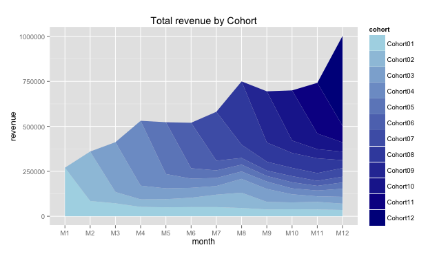
You can see that monthly revenue is highly dependent on new customers who do their first purchases. But during the time company accumulates several layers of incomes from existing (loyal) customers and reduced dependence. Further, it seems like there was some activity (e.g. promo) in the eighth month (M8) and a few cohorts responded. Really helpful chart.
Save
Author
